Weekly Update: Trade the Pattern Within the Pattern
Good evening, and welcome to this week’s edition of Stealth Trades!
Good evening, and welcome to this week’s edition of Traders War Room!
Ever heard of fractals?
They are defined as “infinitely complex geometric patterns that are typically self-similar.” In other words, these are patterns that look similar at different scales.
And they can be hugely beneficial for traders.
18 months ago, I wrote about the breakout I saw coming in gold. And the reason I was so bullish was this concept of fractals.
The breakout pattern I look for appeared on the daily chart… the weekly chart… and even the monthly chart.
Same pattern. Same ticker. But vastly different time frames. Take a look…
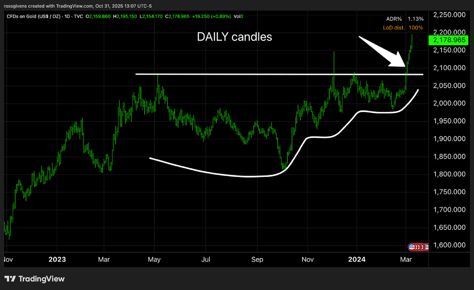


This alignment of multiple time frames in nearly identical patterns foreshadowed what has been the biggest gold rally in over a decade.
13-year base patterns forming on a monthly chart are rare. But we can do the same thing with weekly, daily, hourly and even 5-minute charts.
Take a look at Rigetti Computing (RGTI) – one of the big movers in the quantum computing space. Below is a daily chart highlighting the breakout that took place last month.
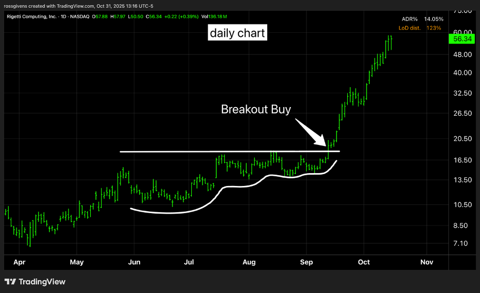
It delivered a 226% peak gain in just over a month.
But it was a volatile stock. Placing a stop loss at the swing low from the week before would have meant risking 20% on the trade.
However, if we zoom into a 5-minute chart of RGTI at that time, look at what we see…
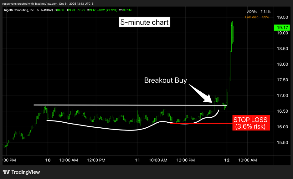
This is a fractal – a similar pattern but on a much shorter time frame.
And with this setup, you could have taken minimal risk of less than 4% on your entry. Maybe it works, maybe it doesn’t.
But so what…
It’s a 3.6% risk. You can take several stabs at it and still not get yourself in trouble. I sometimes refer to this as “day trading my entry.”
A day trader I am not. But I do love high-momentum stocks. And for a lot of them, 20-25% swings are normal.
I won’t risk 25%. But I’ll risk 4% all day long.
Now, let’s look at Rigetti today. Below is a current daily chart. What do you see?
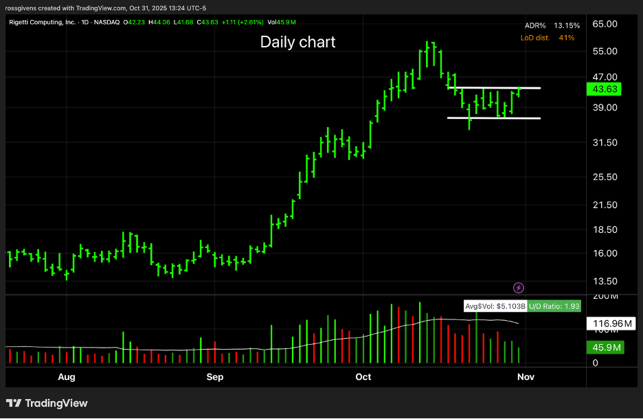
Volume ramped up in that huge September rally. The stock then pulled back and is now consolidating in that $35-$45 range. It is also doing so on decreasing volume – a sign that the selling may be coming to an end.
Buying a breakout above that upper white line and placing a stop loss at the lower one is still a 17% risk.
So, let’s zoom in closer on a 30-minute chart…
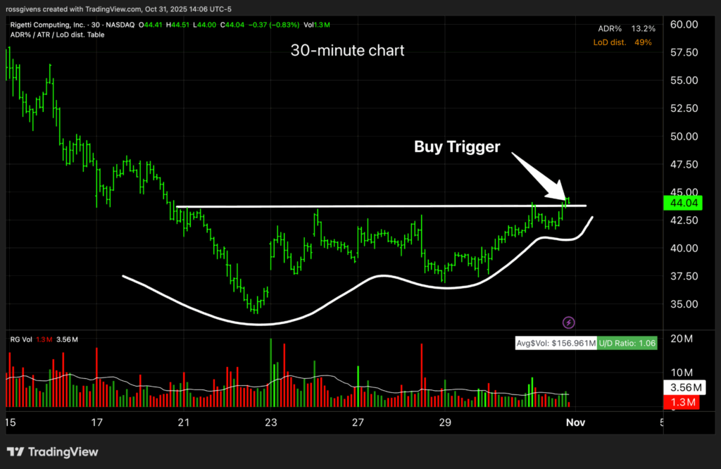
Do you see the pattern?
Remember, we want to see that same shallowing consolidation after a stock pulls back. The same supply and demand principles apply. The stock needs to absorb the supply (get all the sellers out of the way) before it can push higher.
Is this a picture perfect pattern? No. But it’s not bad.
And on a leading stock, in a leading group, in a record-setting bull market… you don’t need perfect.
Plus, the risk is minimal…
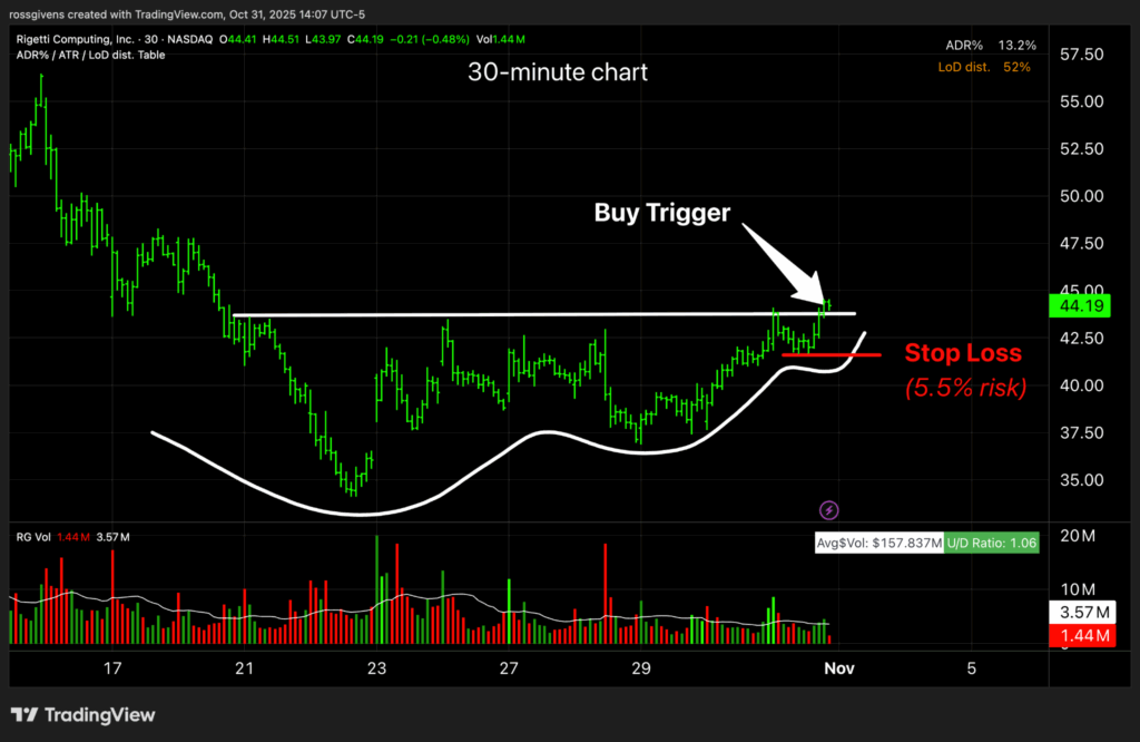
With a stop loss just beneath the swing low here, we are only risking 5.5% on the entry.
This is a stock that just tripled in a month. I can easily justify a five and a half percent risk.
You may be comfortable with bigger stop losses and more risk. I’m a chicken. I like to keep it tight.
I’d rather take a few small losses trying to get into a leading stock than put all of my risk on a single entry.
That’s all for this week. As you read this, I am Trick or Treating with a 6-year-old Bowser (Mario Bros character) and a 3-year-old monkey. Bedtime should be interesting. Pray for me.
Best wishes for your trading,