Weekly Update: This Market Signal Says “BUY”
Good evening, and welcome to this week’s edition of Stealth Trades!
The average investor would have you believe that it is impossible to time the market.
But the average investor is wrong.
Bull and bear markets do not appear out of thin air. There are underlying conditions found in almost every market cycle that, when interpreted properly, allow one to enter near the lows and sell long before things fall apart.
In my March 28 weekly email titled “5 Ugly Charts,” I showcased five of the tools I use to time the market. At the time, they were all bearish.
Two weeks later, these same signals said it was time to buy. So, on April 11th, I sent this:

We are now back within spitting distance of new all-time highs. And if you took my advice, it has been a very profitable two months.

But there is another signal I did not share with you in March – one that allows us to look “beneath the surface” and see how strong or weak the market is.
That signal is the ADVANCE/DECLINE LINE.
The advance/decline line is quite simple. Each day, it counts the number of stocks that went up and down on a given exchange. The net reading is positive if more stocks advanced and negative if more declined.
These figures are also published daily on the Wall Street Journal website.
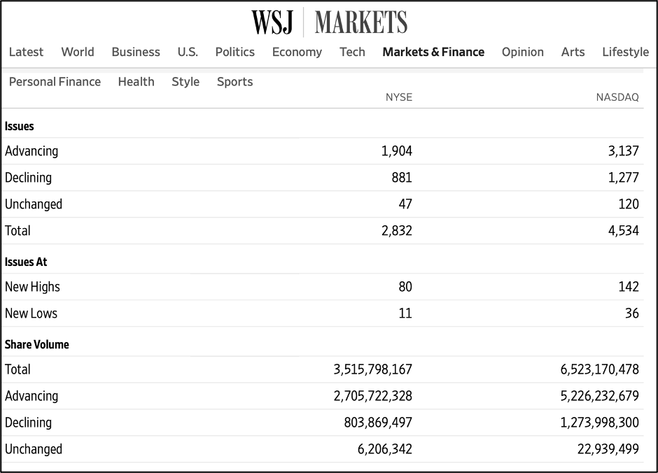
Each day, that reading is added to the previous total, and the result is the advance/decline line.
The goal of this indicator is to show whether we are in a healthy environment where more stocks are rising or an unhealthy one where more names are going down.
And while this may fluctuate a bit day-to-day, a healthy bull market will see a rising advance/decline line. The opposite will be found in bear markets.
So, how can you use this to time the market?
Simple… look for times when it diverges from the index. I’ll show you what I mean.
This is late 2007 – just before the 2008 financial crisis unfolded:

The blue line on top is the S&P 500 index, and the advance/decline line is shown beneath in yellow.
Notice how, in the second half of the year, the stock market was making new all-time highs. This, to the average investor, meant the market was healthy.
But it wasn’t healthy. And the A/D line’s failure to follow suit showed that. A handful of large stocks like Amazon, Apple and Google were carrying the indexes higher – even though most stocks were not back at their highs.
This was your warning sign that things were weak beneath the surface. And if you spotted it, you could have avoided a 40% market decline.
The same thing happened before the 2022 bear market…

Notice how the market was rallying at the end of 2021, but the advance/decline line was not making any progress.
This was a big red flag, and the market tanked the following year.
To me, this is one of the best signals that a bull market has run out of steam.
Luckily, the opposite is also true. When the A/D line is making new highs before the stock market, good things are likely on the horizon.
Following the COVID crash in 2020, this indicator was making new highs several months before the stock market.

This was a signal that the rally was broad-based and strong and likely to continue.
The ensuing bull market of 2020 and 2021 was one of the most powerful on record. In fact, you will see this same trend of the A/D line moving before the market in almost every stock rally.
And that is exactly what we are seeing today.
Following Trump’s tariff-fueled trade war earlier this year, this indicator once again rebounded well ahead of the overall market.

The advance/decline line was making new highs just three weeks after the market bottomed.
That was a very powerful recovery, and stocks have continued to push higher ever since.
Add this tool to your bag. It is a free indicator on TradingView and almost every trading platform.
You’ll be surprised how often it gets you out near the top of the market and back in early off the lows.
Best wishes for your trading,